TextBox, BackDrop and Annotation Components
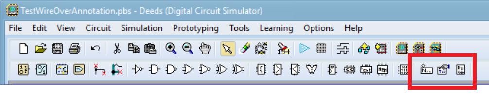
The component bar offers the Annotation, Textbox and Backdrop Components on its right side (see the following figure).
After placing one of these component in the schematic, the specific properties dialog opens.
TextBox Components 
After placing the Textbox in the schematic (blue arrow), its Properties Dialog opens. In this example we choose, among the predefined ones, the suggestion 'Big Title' (green arrow). Then, we introduce the desired text ('Topic Big Title') in the text editor (yellow arrow).
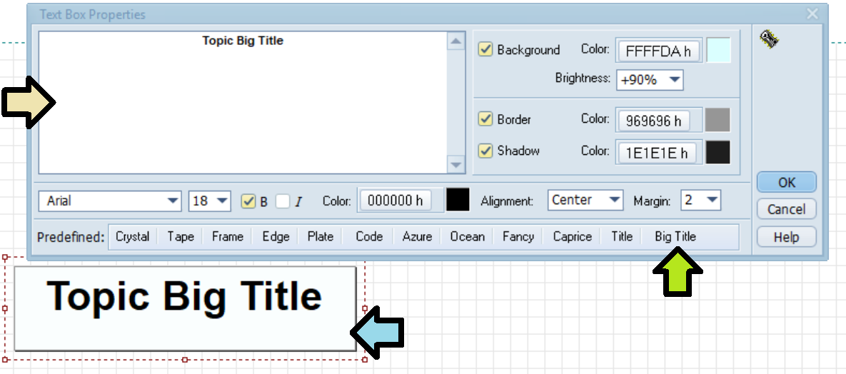
The user can define the text, its position, color and font properties, as well background and border properties. At the bottom of the dialog, we find a toolbar that allows you to choose predefined configurations.
In the TextBox, UNICODE is now supported. It is therefore possible to enter text in any language (see below), it will be regularly saved in the circuit file (click on the figure below to open it in Deeds-DcS).

...to be completed... 
BackDrop Components 
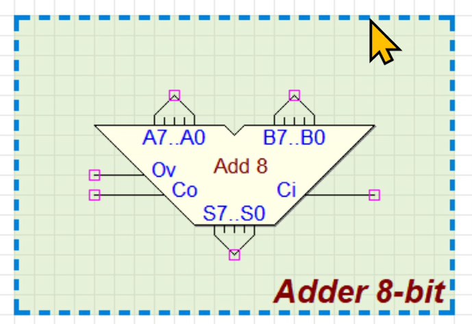
A Backdrop permits to highlight part of the schematic, putting in evidence its function. In the next figure a few examples of the offered possibilities.
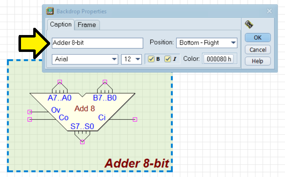
Note that the Backdrop is not a "container", as it would seem, but only a sort of a decoration, and it stays always in background. Immediately after the insertion of a Backdrop (that presents a default size), the Backdrop Properties dialog is shown automatically.
In the following screenshot, we have entered the caption 'Adder 8-bit' (see the yellow arrow), leaving the other parameters at their default values (caption position, color and font properties). A change in the fields will modify immediately the aspect of the Backdrop in the schematic. Only ASCII code is supported in Backdrops (characters are filtered as they are entered by the user).
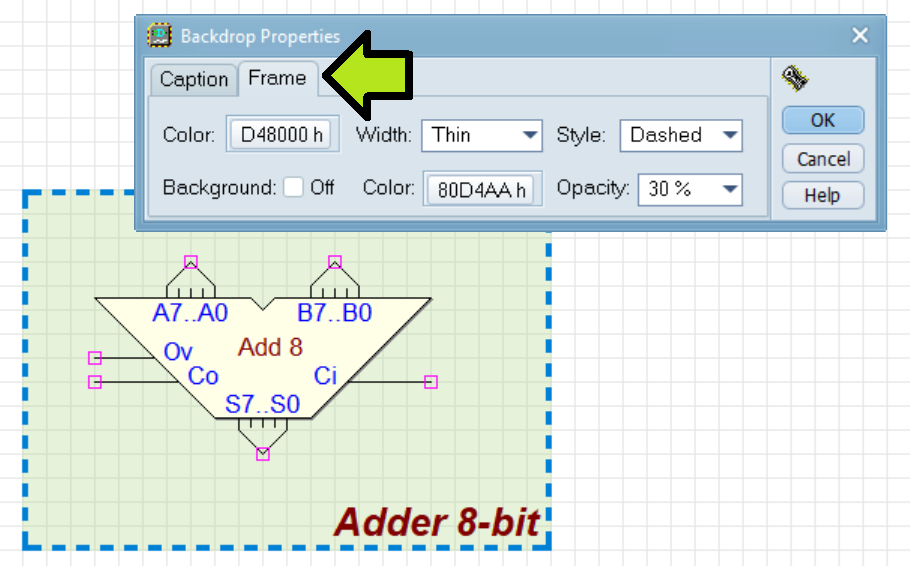
In the page Frame instead, background and border properties are definable. Note that it is possible to define also the Opacity of the background color (see below).
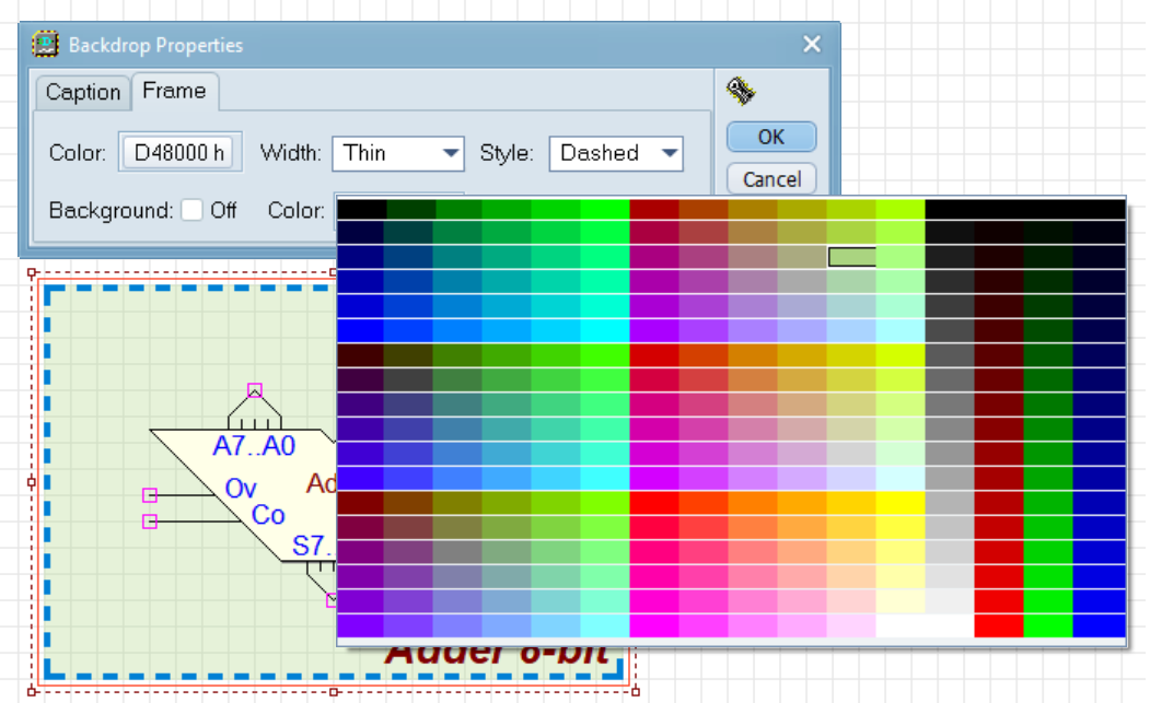
The following example shows the color palette that appears when you click on a button to choice of the desidered one for the specific graphic element.
In the schematic, to select the Background you need to click on its edge (less than one grid step). Once selected, however, you can click to drag it anywhere on its surface, except clicking on any of the components present in it.
...to be completed...
Annotation Components 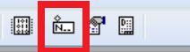
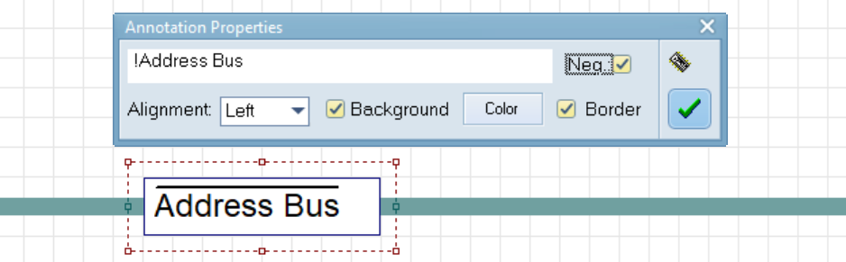
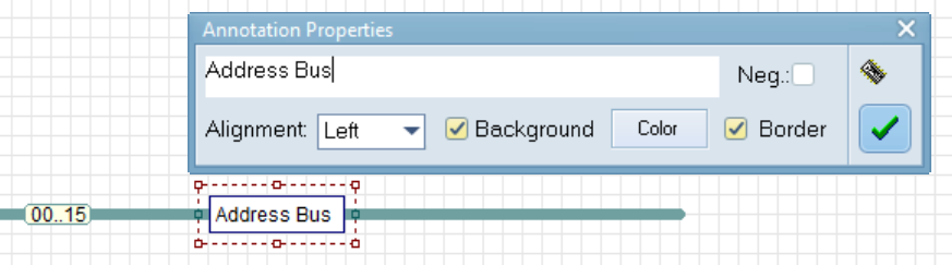
In this example, we took an Annotation component and placed it on top of a Bus. Then, in the Annotation Properties dialog, we type the desired label in the text field. In the present example, we use the default setting (left-aligned text, white background, and visible border).
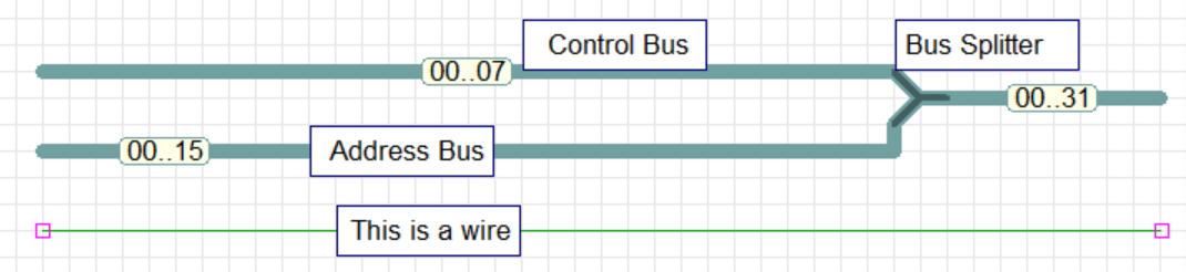
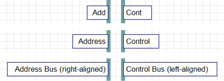
Note that the annotation is drawn above the bus. In fact, Annotations can be placed on top of any type of component (except Annotations themselves). In the next example we see some wire and bus segments with Annotations positioned in various ways.
The Annotations resize themselves, depending on the length of the string. In the following figure, the annotations on the left are right-aligned, the others are left-aligned. The Annotations are represented as if we were entering the text, in order. In the figure they are represented as if we were entering the text, in order, showing where they are anchored. Only ASCII code is supported in Annotations (characters are filtered as they are entered by the user).
In the example below, the Annotation at the top is set without a border, and with a pink background color. The logic gates at the bottom have been overlaid with annotations set to no background (transparent) and no border.
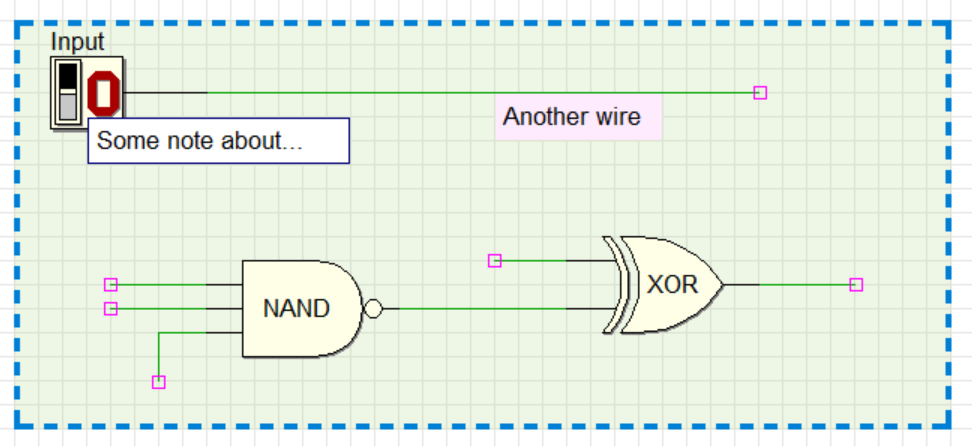
Text in an Annotation can be negated by setting the Neg checkbox, or by adding an exclamation mark in front of the string, just like in the case of normal input and output component labels. The result is an overlined text, as shown below.